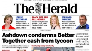
TUESDAY saw The Herald newspaper launch a new look, and here, editor, Magnus Llewellin, explains ‘the story behind’ it.
What exactly was the brief?
 The brief was mine. The Herald has a long and proud tradition and I wanted to do something that played to this, whilst also looking fresh and new. I was also looking to add content and value to the product and ensure that a single design style existed throughout the publication, so that if someone opened any page of the paper they would know they were reading The Herald.
What first struck you about the job?
That I was looking for was evolution, not revolution. Every product needs to be looked at every so often and The Herald is no exception. The next thing that struck me was the question: ‘Who is going to do this?’
Describe the process from conception to completion
Luckily, the answer to the last question was in-house. Firstly, I spoke to our chief sub, Andy Clark. We then approached graphics editor, Larraine Rowney, and assistant sports editor, Gordon Stevenson. I explained I was looking for some changes, what I wanted and didn’t want and asked them to come back with some design ideas, which they did.
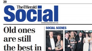
 At the same time I asked Herald senior assistant editor, Graeme Smith and Brodie Duncan, our group multimedia editor, to add flesh to the bones of a plan for a Social page. I did the same with Barclay McBain, Herald deputy editor, regarding changes I wanted to make to our Comment pages.
From start to finish, the process took about eight weeks, which is a remarkable achievement, all things considered, and a credit to those involved.
Pantone numbers, fonts, use of space, kit, etc?
To give greater reader value, we reduced the text size, from 8.3pt, with leading of 10pt, to 8pt, with 9.5pt leading. That gives us between ten per cent and 15 per cent more content in any given area, without any reduction in readability, which will allow us to give readers additional value.
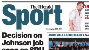
All parts of The Herald in print now have a have a new look but the most striking changes are in the Arts section and in Sport.
In Arts, the column width was changed to bring a cleaner, neater look while actually making the pages easier to work on for production staff.
 In Sport, we have ditched all the white-on-black headlines and changed the lead heading style, to ensure greater impact without reducing the number of words on each page.
What most excited you about the project and what pleases you the most about the finished article?
The chance to make some improvements to the paper whilst retaining what I believe are all the good elements inherited from my predecessors. I was pleased by the reaction (both externally and within the workplace) to what we have done – full in the knowledge that this can only be the start, as other changes will also need to be made.
Any particular inspirations from your past that have shaped you and your work?
I used to work at The Scotsman with Nigel Donaldson, who ran production there, and he was at the back of my mind when we began this process.
Been impressed recently by someone else’s work?
I am not a designer so I ashamed to say not recently – although I have always admired the work of Ally Palmer and Terry Watson.


